Aprender Design

Sep 8, 2023

Decoding Identities student showcase

Aprender Design

School

Instructed by Carlos Bocai (Base) and Julia B. Aguiar (Jones Knowles Ritchie), Decoding Identities is a course on the process of creating authentic and impactful visual identity systems. It’s a collective exercise where students are invited to engage in discussions that deconstruct the notion of "good design" by delving into methods, trends, category codes, and real case studies.

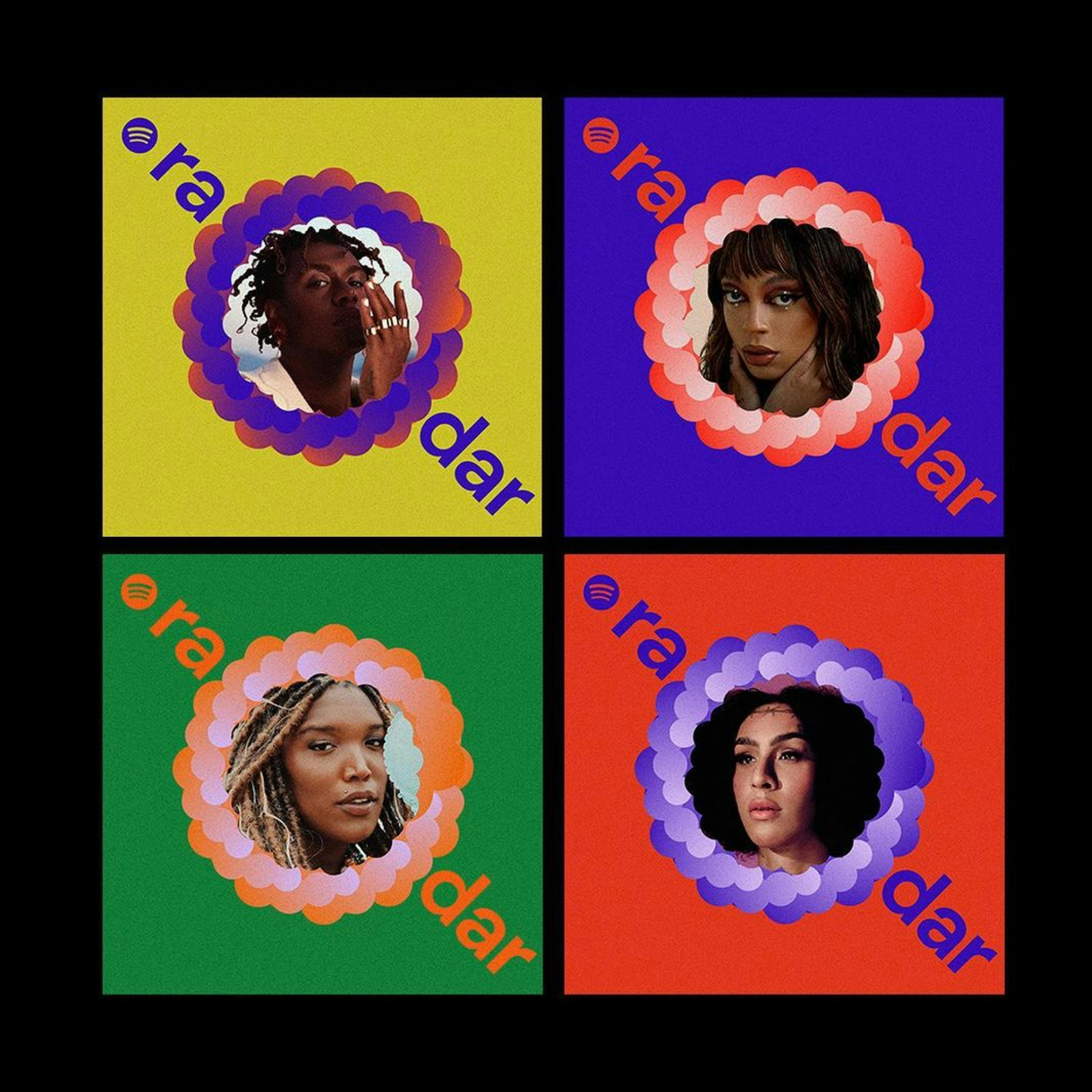
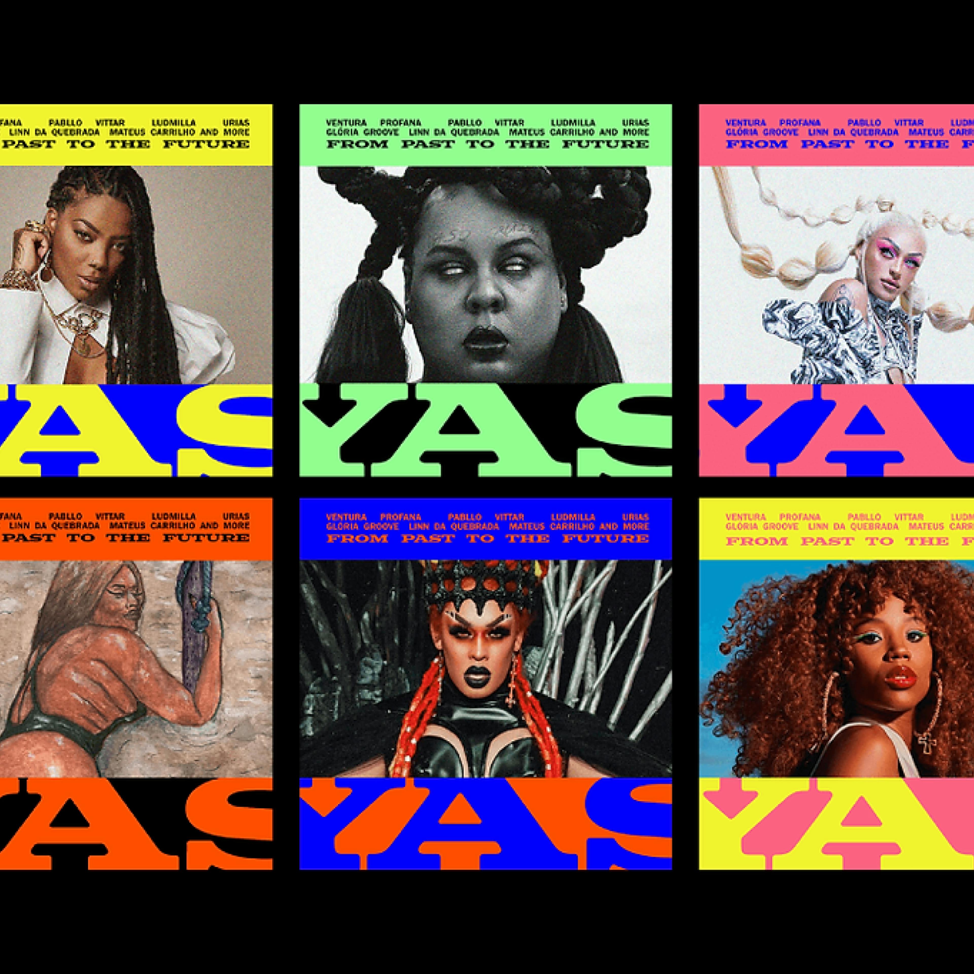
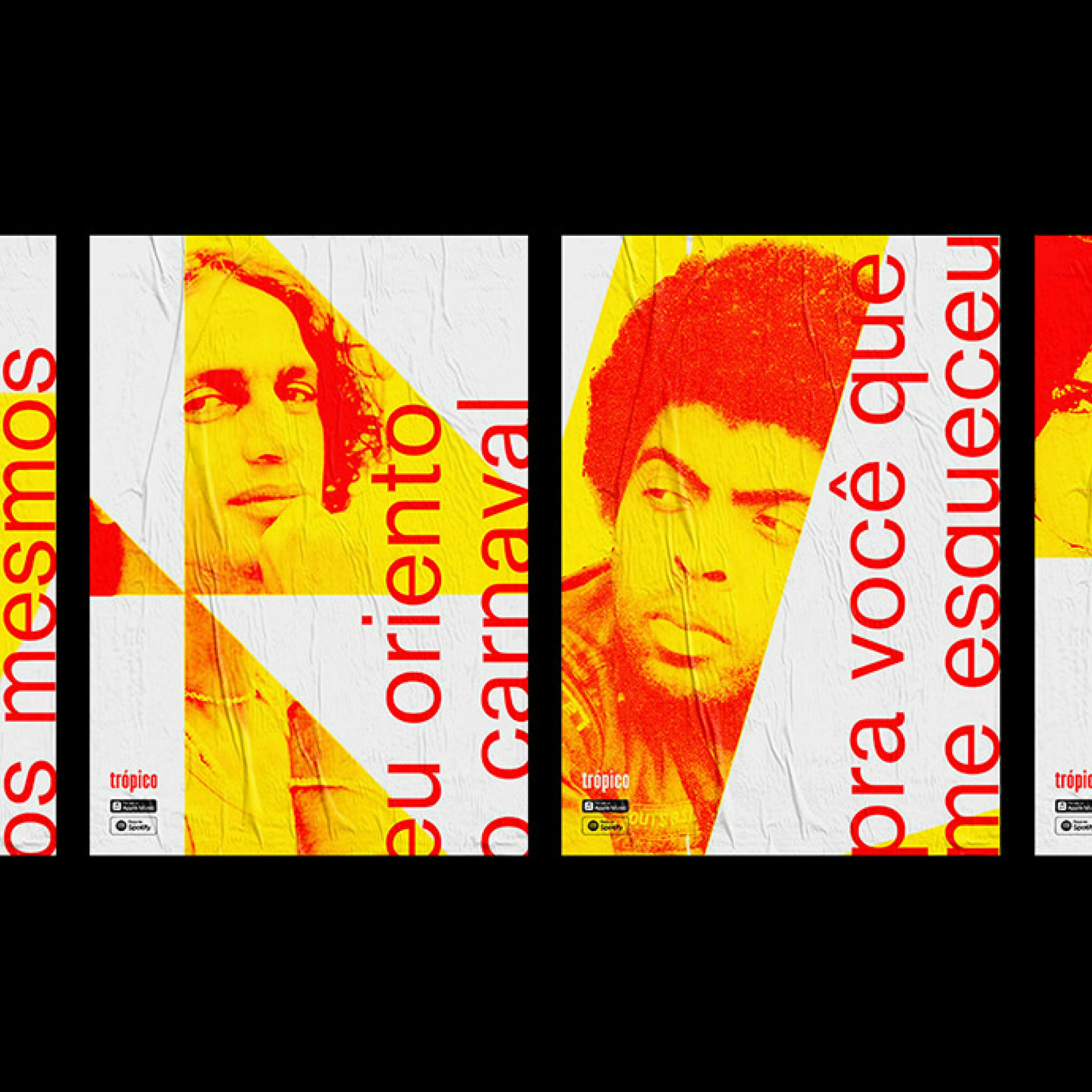
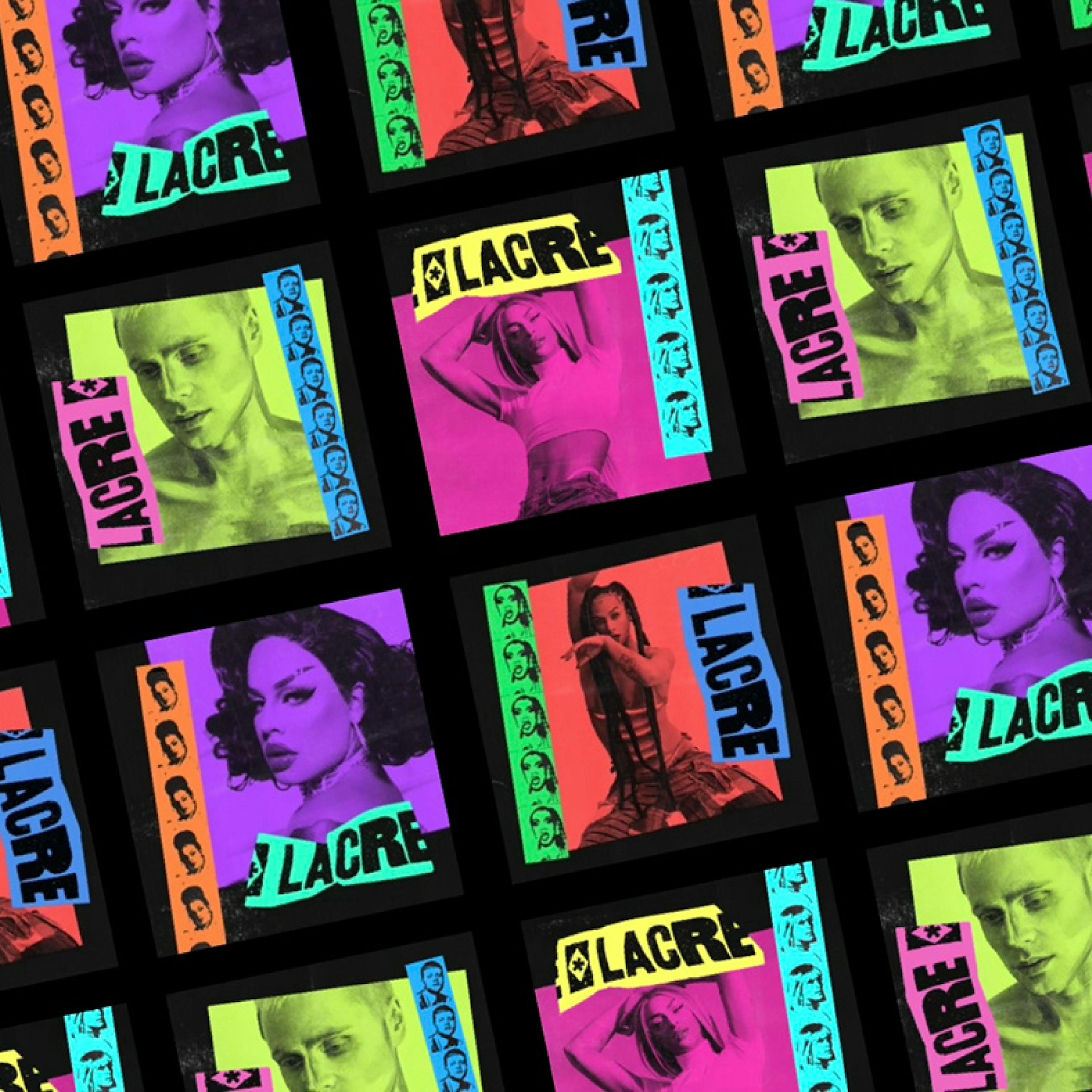
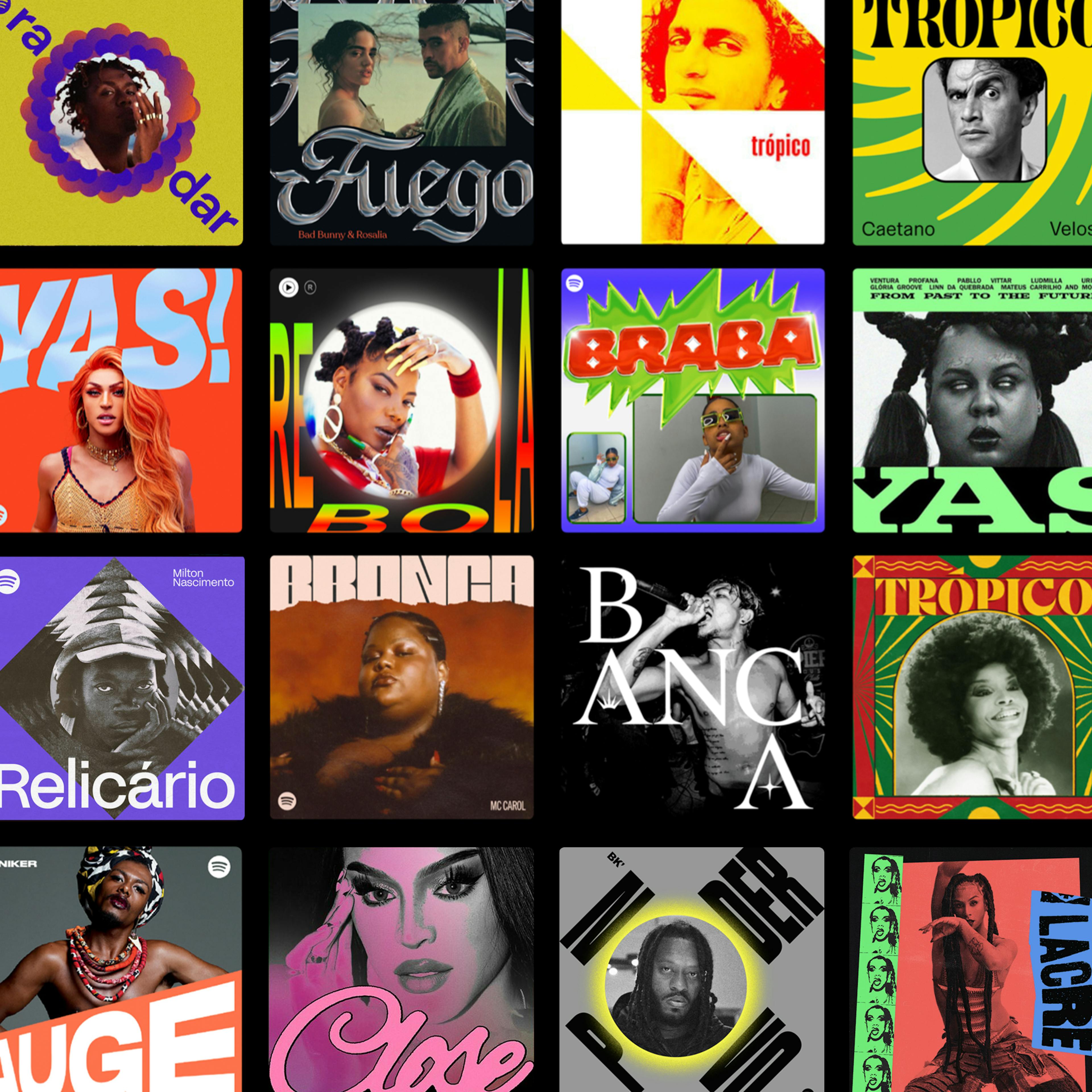
As a way to apply the learnings and discussions, the students are given a group project to present at the end of the course. Provided with 1:1 mentorship, each group is tasked with designing a visual identity system for a music playlist. Since the playlists vary in genre, each comes with its own set of challenges, and students are free to choose their preferred subject.

By working on this project, each group goes through the entire process of creating a unique system, from concept development to creative execution. Below are some of our featured projects from previous classes:

Relicário, by Tom Saavedra, Adriana Rojas and Amanda Eyer. 

"To develop the visual identity system, we sought inspiration in the shape of the Brazilian flag and the power of its artists, which continues to resonate today. The color palette contrasts with the black and white of historical photos, while the wave-like forms represent growth”.

Full Case Study

Radar, by Mariana Luz, Camila Barriviera and Bruno Portella.

"A playlist to map, highlight, and illuminate the power of Brazilian LGBTQIA+ voices. The visual identity was built upon three pillars: word and potency; mapping, pointing, and highlighting; cutting out our history."

Full Case Study

Yas, by Lucas D`ascenção, Euller Cardoso and Paulo Silvino.

"A fictional playlist focused on introducing new Brazilian LGBTQIAP+ artists to a global audience. The history of the movement in Brazil, the establishment of new legacies in the present, and the diverse and pervasive nature of the rhythms and lifestyles within this culture served as our inspiration to develop an identity that envisions fresh opportunities for emerging LGBTQIA+ artists, building upon existing trajectories. The typography employed in this project was selected from the inaugural LGBTQIA+ publications in the country. Additionally, we devised a grid pattern influenced by the 'rainbow flag' and a vibrant, contemporary color palette to further enhance the project's impact”.

Full Case Study

Fuego, by Adson Rodrigues, Kaique Valente and Mayra Souza. 

"This playlist features Reggaeton music with the aim of introducing the musical genre to a mainstream audience. The objective is to provide a cultural experience through music. Artists like Bad Bunny, Anitta, J Balvin, and many others are highlighted in Fuego. The process of designing the visual identity was supported by three essential aspects to understand Reggaeton beyond clichés: History, Culture, and Behavior. The result is a visual identity that revives elements of Latin aesthetics, synthesizing and presenting them in a simple, contextualized, and comprehensive manner."

Full Case Study

BRABA, by Lucas Ramos, Matheus Franceschi and Rafa de Prada.

"BRABA is a playlist that celebrates Funk and Brega Funk music and culture. The visual system is guided by three principles: rawness, resilience, and impact. The identity features a large, weighty, and attention-grabbing title, directly referencing the typography found in dance party banners. The underlying concept conveys the dynamic rhythms, and the chroma effect takes inspiration from the brass instruments prevalent in Funk and Brega Funk sounds. The identity strongly connects with the reality and life history of Brazil's favelas and peripheries, offering representation and resonance."

Full Case Study

Trópico, by Paulo Madeira and Giovana Romano.

"The visual identity of the Trópico playlist embodies the essence of the Brazilian Tropicália movement. At present, we are in a phase where the main visual representation of the country, the flag, has become linked to far-right movements.

Hence, the visual design of the playlist incorporates elements that invoke Brazilian culture. This addresses the regrettable enduring nature of songs composed during a politically tumultuous era while also strengthening the aesthetic and ideology associated with renowned Tropicália artists."

Full Case Study

LΛCɌE, by Fernando Gomes, Lucas Guedes and Juan Pablo Rahal

“The playlist visual identity draws from three key concepts: intersection, where we see Brazilian Pop music as a convergence point for LGBTQI+ artists from diverse backgrounds and genres; fragmentation, as we embrace specific viewpoints and fragments of a richly diverse scene; and Brazilian essence, reflecting our aim to use the playlist to showcase and promote queer Brazilian artists internationally. The typefaces align with our conceptual approach, including CuirRomanTimes and Desvial from the Cidade Queer project. Together, these elements signify the convergence of musical styles and identity genres, offering adaptability within our visual system.”

Full Case Study

Rebola by Felipe Souza.

“Rebola is a playlist of Brega Funk hits that aims to escape stereotypes and innovate, connecting with the culture behave the genre, bringing soul and a lot of movement.

The genre has an audience and artists with strong and notable personalities, that make a presence for where it goes. We look to get close to these personalities, picking colors from the artist, guiding the visual of each cover.”

Full Case Study

Auge by Laíssa Moreira and Marcella Fagundes.

“The visual system seeks to celebrate the identity and pride of the queer community, based on the concept that "to be at the peak is to be at the top". The graphic identity explores the rise of the word "Auge" in the typography itself, giving the impression that the word grows as does pride in being LGBTQIA+ reconciled to a palette that maintains a flashy and contrasting tone. Loud, bold and timeless, the Auge playlist system aims to always be in the spotlight, occupying graphic and physical spaces as a representative of the LGBTQIA+ community.”

Full Case Study

Yas! by Fabiana Nakasone, Lohan Tostes, Richard Rodrigues and Vinícius Santos.

“Yas” is a celebratory slang that represents the LGBTQIA+ Brazilian pop playlist. To express this idea, we created a variety of YAS! inspired by a flag, representing the community's fight and referencing each person's different expressions."

Full Case Study

Novo Poder by Leonardo Beijo and Gabriel Alves.

“Thinking of visual elements that could fit the concept of "collectivity", "union" and "complement", I noticed that placing the word "Novo" "Poder" one below the other, the letter "O" is in exactly the same position. Rotating one word at an angle of 45º and another at -45º I find the perfect fit. So at that moment is the concept of the playlist. One word complements the other, bringing this idea of bonding and unity that make Hip Hop happen.”

Full Case Study

Close by Hugo Ribeiro and Luiza Ribeiro. 

Close is a playlist of Brazilian LGBTQIA+ artists. The visual identity was created based on three pillars: plural identities (the queer artist is an important vector for the representation of various identities), timeless (by including artists from different eras of the brazilian queer culture) and evidence (in Brazil, Close is a slang for "wanting all the attention for yourself, behaving extravagantly in order to show off", so we think of Close as an conceptual idea of framing, to always highlight the artists and their voices).

Full Case Study

Enroll now in a course that encourages collaborative practice. Gain insight into the process of crafting consistent and genuine visual identity systems.